Monday, July 13, 2015

Week 8 - AppsGIS - Damage Assessment

This week we looked at damage assessment, using information for Hurricane Sandy. We started by mapping the path of the hurricane, showing the category of the storm, barometric pressure, and wind speed at different points. The map shows the countries, as well as states within the United States, impacted by the storm.

We then "prepared" the data by adding in aerial photos of before and after the storm, so that the images could be compared. We did this using the flicker and slider tools in the Effects Toolbar. We also used Editing sessions to add attribute data, using attribute domains and changing their properties to utilize both codes and descriptions (i.e. for Structure Type: 1 - Residential, 2 - Government, 3 - Industrial, 4 - Unknown). 

A major part of our analysis was creating new damage data for the imagery. An Edit session was started for a newly created feature class (with the domains created beforehand). Using the pre-storm imagery, buildings were selected, and then their domains set to describe the building. Categories were structure damage, wind damage, inundation and structure type. In order to perform this, used the "create features" window to select the point option, and a point was placed on a building within our study area. Then clicked on the attribute tab so that the attributes could be adjusted according to the evaluation. The Swipe tool was used to compare the before and after.

Digitized all of the buildings in the study area this way, changing the attributes after placement to reflect the post-storm imagery. The resulting points were categorized based off of structure damage level:


 I chose to fill in all of the values for each point, not just structure damage level.

Afterwards, we used a new polyline feature class to show the location of the coastline prior to the storm. A simple straight line was used because we wanted to show the number of buildings affected (and how) in relation to the coastline (i.e. how many buildings within 100 meters of the coast have major damage?). In order to determine the number of buildings within each distance, used the Select by Location tool to select the parcels within the distance. For 0-100, did a simple “select features from” selection, with the Coastline layer as the source layer, and the selection method of “are within a distance of the source layer”. For both the 100-200 and 200-300, did a select features from, with the maximum distance, followed by a “removed from the selection” for values less than the intended range. Final results were exported to a new layer. To determine the number of buildings at each structure damage level, used the Select by Attributes tool within each (new) layer’s attribute table. This was done in order to be able to look at patterns of damage seen.
 

After we did the above, we combined the spatial assessment data with the parcel data, so that we could match the attributes within the table. This was accomplished using the Attribute Transfer tool. This was done for approximately 1/3 of the buildings within the study area.

I thoroughly enjoyed this week's exercise and learning how damage assessments are formed. It helped make the limitations of aerial imagery more apparent, such as when it is hard to tell if damage is from the wind or not. It will definitely come in handy the next time there is a hurricane here!

Saturday, July 4, 2015

Week 7 - AppsGIS - Coastal Flooding

This week we worked with Coastal Flooding from sea level rise and from storm surge. For the sea level rise, we looked at two scenarios, one with a 3 foot rise, and one with a 6 foot rise. We then mapped the results and how it relates to population density. Later, for storm surge analysis, we compared two different DEM models.

In order to do look at the impact of sea level rise, we started with a DEM raster of the area, which we then wanted to extract only those cells that would be impacted by the associated rise in sea level. To this, the Reclassify tool was used, and the data was reclassified so that only the values of interest (to 3 feet or 6 feet) were included, all others were changed to "NoData". The resulting attribute table was looked at to determine the number of cells that are flooded (value of 1) and not flooded (value of 0). 
We then looked at the Properties of the Layer in order to determine that the cells of the raster are 9 m2. This was multiplied by the number of cells within each floodzone to determine the area.

To analyze the depth of flooding, I used the results from the Reclassify Tool as the input in the Times tool, in order to create a new raster of only the floodzone elevations. In order to get the flooded depth, used the Minus Tool, with either the equivalent of either 3 feet or 6 feet, and the results from the Times Tool as the second input. These results were then mapped against the population density of the census tracts (this map is only for a rise of 6 feet):
Figure 1. Map of District of Honolulu showing impact of 6 foot sea level rise, and
includes population densities of the region.

We then wanted to look at the social vulnerability of the are, with data from the 2010 Census for the area. In order to do this, we first had to determine which census blocks were located within the floodzones. For our analysis, we chose to select those whose centroid was located in the floodzone, using the Select By Location tool. Looking at the Attribute Table, we were able to determine how many blocks were selected, and what population this affects. This can be done simply looking at the Statistics for the column of choice, as only the selected rows are summarized.

Next, we had to add fields in the Census tracts layer for each of the groups of interest, percent white residents, percent owner-occupied homes and percent homes with people over the age of 65. Table joins were then conducted in order to copy over the information. Each join was removed prior to joining another. The Field Calculator was used to fill in the data. 

This was then repeated for the Census Blocks layer, with additional fields added for the population of white residents, owner-occupied homes, and those over the age of 65. For our analysis, the census blocks did not include the make-up of each block, so the census tract data was used. For this, it was assumed that the population composition for the whole was equal for the part. A Table Join was created so that the percentage could be copied over. This percentage was then used to determine the size of the population for each of the three social statuses. Used the Select by Location tool to select the blocks that had their centroid located within the floodzone, as above, for both 3 and 6 feet. Then used the Statistics function to get the sum for each population in order to fill out the table in Deliverable 7. To get the values for the nonflooded areas, simply switched the selection. Did this for all of the variables in the table. Then divided the populations for each variable by the total population for that category (3 feet flooded, 3 feet not-flooded, etc).

The results were as follows:

Variable
Entire District
3 Feet Scenario
6 Feet Scenario


Flooded
Not-flooded
Flooded
Not-flooded
Total Population
1,360,301
8,544
1,351,757
60,005
1,300,296
% White
24.7 %
36.8 %
24.7 %
29.6 %
24.5 %
% Owner-occupied
58.2 %
32.2 %
58.3 %
38.1 %
59.1 %
% 65 and older
14.3 %
17.11 %
14.3 %
17.0 %
14.2 %
Table 1. Percent of population represented by each group in flooded areas compared to not-flooded areas. Results are for 3 and 6 feet of sea level rise.
After this analysis, we looked at storm surge in Collier County, Florida. The purpose for this analysis was to compare the results of two different DEMs, one by USGS created using older methods (and lower resolution), and one created using Lidar. In order to compare the two, percent error in omission (not including data that should be) and percent error in commission (false positives). For our analysis, the Lidar data was treated as accurate for the calculations. The results were quite different, and showed the major benefits of Lidar techniques, with most errors of commission being above 100%.

Being a resident of Florida, this week's analysis was quite intriguing and interesting to do. I especially liked being able to look at how seeming small levels of sea level rise can affect such large areas. I certainly used the NOAA Sea Level Viewer to see if my house was in danger, especially since our yard floods quite a bit in heavy rains. I expect to use this new knowledge quite a bit in my future.

Monday, June 29, 2015

Week 6 - AppsGIS - Hotspot Analysis

This week we looked at hotspot mapping, using crime data. We compared the results of three different methods: Kernel Density, Local Moran’s I, and Grid Method. We used different data to determine things such as burglaries per housing unit and homes for rent per census tract. We also used the graphing abilities of ArcMap in order to compare the results, such as:

Figure 1. Graph of burglary rate per housing unit compared to
number of housing units that are rented.

We also looked at Kernel Density hotspots, based off of the average, twice the average, three times the average, etc.

Figure 2. Kernel Density analysis of crimes.

Finally, we performed all three methods of analysis on the same dataset of burglaries in Albuquerque, New Mexico in 2007. We wanted to see how the results compared to one another, as well as how well it predicted crimes in the following year.

For the grid-based thematic mapping, first a Spatial Join was created in order to combine the grids with the burglaries in 2007. A SQL query was set: Join_Count = 0, then switched the selection to choose all grids with at least 1 crime. This was exported into a new shapefile of the grids where crime occurred. Then sorted the attribute table by descending crime counts for each grid. The grids with the top 20% of the number of crimes were selected and exported as a new shapefile. In this attribute table, added a new field named “Dissolve” and the field calculator was used to set the values to 1 for all of the grids. This way, the Dissolve tool could be used in order to create one polygon as the result.

Figure 3. Grid-based thematic mapping result of burglary hotspot areas
(top 20% number of crimes per grid).

For Kernel Density, the Environments were set to those of Grids for both Processing Extent and Raster Analysis Settings. For the Kernel Density tool, the Burglaries dataset was used with a search radius set at .5 miles, or 2640 feet. The symbology, was adjusted in order to determine the mean value (of crimes) when areas with 0 crimes were excluded, and then categories were adjusted to 0 – mean, mean to 2xMean, 2xMean to 3xMean, etc. Reclassified the raster so that all values below 3xMean equal to NoData, and all values above are classified as 1. This was then turned from Raster to Polygon, and then dissolved into one polygon.

Figure 4. Kernel Density result of burglary hotspot areas
(higher than 3 times the average).

In order to perform the Moran’s I analysis, I first performed a Spatial Join as before. The Match Option was set to “Contains” so that the count would be for the number of points within each polygon (census block). One large polygon was removed because it was outside of the police jurisdiction, and was impacting analysis. Within the attribute table of the shapefile, a New Field was added for Crime_Rate. Using the Field Calculator, Crime_Rate was set to = [Join_Count] / [HSE_UNITS] * 1000. This divides the number of crimes per census block by the number of housing units, and then multiplies this number by a thousand, which is a common threshold for this type of analysis. Cluster and Outlier Analysis (Anlesin Local Morans I) was then performed, with the Input Field set as the calculated crime rate. Within the attribute table of the resulting shapefile, used Select by Attributes to select the entries with High-High (HH) cluster results. This refers to the areas with a high crime rate in close proximity to other areas with high crime rates. The selection was then exported to create a new shapefile. Dissolve tool was used to create a single polygon out of the resulting hotspots.

Figure 5. Local Moran’s I result of areas with high-high crime rates.
These maps were then combined onto one map in order to show how the analyses overlap. Afterwards, additional steps were taken in order to determine if the hotspots accurately determined the area of high crime for the next year (2008). Analysis was based primarily on crimes per square kilometer within each determined hotspot, as this gives the best picture.

Figure 6. Map output showing the overlap of the three hotspot analyses.


Monday, June 22, 2015

Week 5 - AppsGIS - Spatial Accessibility

This week we worked with Network Analyst in order to learn more about spatial accessibility modeling. For the first part of the assignment, we used some of the ESRI tutorials. These tutorials were very easy to follow, and made the process go smoothly. My only complaint is that it was annoying to have to go back and forth between windows trying to follow the directions. I have gotten used to using my tablet to read the lab instructions, while working on the lab on my laptop. Makes for a much easier time. Unfortunately, this is not an option when working through ArcGIS Help.

Additionally, we worked with data looking at hospital accessibility in Georgia. Much of the analysis was performed using the Join features followed by working in Excel. I have much more experience in Excel, but had not done much with data from ArcMap. Our results were primarily shown in either tables, or in Cumulative Distribution Functions (CDF), such as below:
Figure 1. Distance to nearest psych hospital, shown by age group. This graph shows
that more of the elderly population live farther from hospitals than those under 65.
 Finally, we used Network Analyst to look at spatial accessibility of community colleges in Travis County, Texas. We looked at the service areas of seven colleges in the area, with 5, 10, and 15 minute drive times. We first used the New Service Area function to set the colleges as facilities, and adjusted the settings so that the impedance was set to the time intervals. We solved the analysis to obtain a total of 21 service area polygons. This was repeated after removing one of the colleges from the data set, Cypress Creek Campus. The comparison resulted in the following:
Figure 2. Map showing the comparison of the service areas of the community
colleges 
of Travis County, Texas

We then used Closest Facility analysis to determine the closest facilities (colleges) to each of the census blocks. We again performed two analyses, one for all seven schools, and one for six schools (due to removal of Cypress Creek Campus). Luckily, you don't have to set up the parameters each time you want to run the analysis. After the analysis was performed, the tables were joined so that the information could be compared. We had to adjust the tables, though, as the FIPS code was not included in the tables of the Closest Facility analysis. Using Excel, the information in the completed table were analyzed to determine the spatial access for potential students in the area, before and after the closure of the college.

Looking at the attribute table, we had to select only those census blocks that were affected by the closure, and use the information within the attribute table to determine how they were impacted through changes in drive time. Lastly, we created a CDF of the information:
Figure 3. Resulting CDF for potential students affected by closure of Cypress Creek Campus.
I enjoyed learning about spatial accessibility this week, and feel that I am quite capable in this type of analysis. This clearly has many different potential applications in GIS analysis, and I am already thinking about how it can be used at my work.

Monday, June 15, 2015

Week 4 - AppsGIS - Visibility Analysis

This week we worked on visibility analysis, using the Viewshed and Line-of-Sight tools. We worked with 4 different scenarios: viewshed looking at tower placement, security camera placement via viewshed, line of sight among summits, and and visibility of portions of Yellowstone State Park from roads.

For the security camera analysis, we worked with a raster that showed the finish line for the Boston Marathon, and were tasked with adding more cameras that could see the finish line. The view for the given camera was first for a 360 degree view at ground level. This is not the case of a typical camera, and so was later edited to account for it being on the side of a building (100 feet high) and a 90 degree view.
Figure 1. Visibility of camera near the finish line of Boston Marathon.
This is based off of 360 degree view of the camera at ground level.

The task for this portion of the assignment was to place two new cameras that would better cover the finish line. We had to place the cameras, adjust their horizontal viewing angle, and their vertical height. For the two cameras, one  was close to the finish line (Camera 2) and one on the opposite side of the finish line from the first camera (Camera 3). Camera 2 was placed in a building to the north of the finish line, on the north side of the road. The vertical offset for this camera was 75 feet, determined by a digital elevation model that included buildings. The viewing angle for Camera 2 was set to 90 - 180 degrees. This part took quite a bit of tweaking, as the degrees were not as expected and it took a while to get them right. I still am not sure why this was the case. Camera 3 had a viewing angle of 180 - 270 degrees, and was as expected visually. This camera was set to a 100 foot vertical offset, and was located about half a block west from the finish line. To show the overlap of the viewsheds, they were ranked by number of cameras that could see each cell, as shown below:
Figure 3. Overlap of viewsheds for cameras placed near the Boston Marathon finish line. Dark blue represents areas that are visible from all three cameras.
I was pleased with how this analysis came out, as the area around the finish line is quite visible. A way to improve this analysis, in my opinion, would be by ranking the distance from the camera as well. A camera does not see as well far away as it does close up, and this should be taken into consideration. I worked with closed circuit television (CCTV) monitoring, and have seen this first hand. Visibility analysis is clearly a tool that can be used in a multitude of applications, and it was neat to see how my other classmates felt it could be used. That is definitely a benefit of this class, that we all have different backgrounds, so see different "big pictures".

Monday, June 8, 2015

Week 3 - AppsGIS - Watershed Analysis

Figure 1. Final map comparing modeled and given streams and a watershed on the island of Kuauai.

This week we worked on watershed analysis of the Hawaiian island of Kuauai, comparing modeled results with actual streams and watersheds. First, we performed watershed delineation using streams as pour points. In order to do so, the digital elevation model (DEM) was filled-in using the Fill tool to remove any sinks. Most of the sinks removed were in the low elevation areas to the west side of the island. Now that the model is hydrologically correct, the Flow Direction tool was used to establish how the streams will flow. Following this, we used the Flow Accumulation, with the flow direction raster as an input, which resulted in a stream network:
Figure 2. Modeled stream network.
We then set a condition that all of the streams are defined by having at least the flow of  200 cells accumulated downstream. The resulting raster was turned into a feature class via the Stream to Feature tool. We additionally created a stream order raster that used the Strahler method to order the streams created via the Conditional tool.

The next part of our analysis was delineating a watershed using stream segments (Created with the Stream Link tool) as the pour points. Using the Basin tool, we then used the edges of the DEM to delineate drainage basins:
Figure 3. Delineated basins using the edges of the DEM.
Alternately, we used the river output as the pour point to delineate watersheds. This required us to use Editor to mark the pour point at the mouth of the river of the largest watershed (dark green in the image above), known as the Waimea watershed. This pour point was at the edge of the DEM, which is why it matched the basin result above. We also used a pour point in the middle of the DEM, which was a gauging station used by USGS. This station was not on a modeled stream, so the Snap Pour Point tool was used to correct for this. The Watershed tool was again used to create a watershed raster for the specified gauging station:
Figure 4. Watershed raster based off of USGS gauging station.
Finally, we compared our modeled results from above with streams delineated based off of aerial photos, and previously mapped watersheds. For the streams, it was quite apparent that modeled streams are quite different than given streams at extreme elevations, however, they "match" quite nicely at mid-elevation.
Figure 5. Modeled streams (light blue) compared to given
streams (dark blue) at low elevations.
Figure 6. Modeled streams (light blue) compared to given streams (dark blue) at high elevations.
Figure 7. Modeled streams (light blue) compared to given 
streams (dark blue) at mid-elevation.
For the watershed analysis, I chose the Wainiha watershed to model, with the pour point located at the output of the river. Looking at the modeled and given watersheds, they lined up quite nicely. 
Figure 8. Modeled watershed (light purple) compared to given 
watershed (red outline). There was little excess in the modeled
output, but the northernmost point was "missing".
The analyses we used this week were very interesting, and I can see how they will be highly beneficial later down the line. I liked the fact that we performed the analysis using different tools and methods so that we can see the options available to us. 

Monday, June 1, 2015

Week 2 - AppsGIS - Corridor Analysis

Figure 1. Raster of the proposed black bear corridor between two sections of national forest.
This week we worked on least-cost path and corridor analysis. For the first portion, we looked at a few different least-cost paths for a pipeline by creating cost surfaces for slope and proximity to rivers. We created three different scenarios by changing the cost of being close to rivers. For the first path, we only looked at a slope, which was reclassified so that the lowest cost was for low slopes (<2°) and highest for steep slopes (>30°). A cost surface raster was created, followed by a cost distance raster, with accumulative costs as you move away from the source. The source is at the top of the image, indicated in light blue, and the destination is represented with a dark blue asterisk. With this analysis, there are 4 river crossings, which were determined using the Intersect tool. A backlink raster was also created, so that a least-cost could be created using the Cost Path tool. 
Figure 2. Scenario 1, showing least-cost path with slope as the cost surface.
For the second scenario, we created a cost surface with a high cost for rivers, which resulted in fewer pipeline intersections. In order to combine the two cost surfaces, the Raster Calculator was used. For the third scenario, we used a high cost for rivers, and a slightly lower cost for the area close to a river (within 500 m). We again had two intersections, but they were at different areas. The following image compares the two:

Figure 3. Scenarios 2 and 3, with the path for Scenario 2 in darker red, and Scenario 3 in brighter red. Both paths cross the rivers a two points, but the location varies due to adding cost to being within 500 m of a river.
Additionally, we created a corridor for the same pipeline. Some layers could be reused, but we had to perform cost distance again, this time with the destination as a "source" since the Corridor tool requires two source inputs. After using the Corridor tool to create a range of possible paths, symbology was adjusted to represent 105, 110 and 115% of the minimum value. My image is slightly off from the example in the lab, I believe that this is due to differences in rounding when calculating the path values. I tried several different sets of numbers, to no avail. The following image is the result: 

Figure 4. Corridor result for the pipeline, with the least-cost path for the third scenario (high cost for rivers, lower cost for adjacency to rivers). Darker corridor is most similar to least-cost path, at 105% of the minimum cost value (path).


Finally, we conducted corridor analysis for a black bear corridor between two fragments of the Coronado National forest. In order to determine the best corridor, cost surface analysis for elevation, land cover and proximity to roads was conducted. Cost determination was based on the parameters that black bears prefer mid-elevation areas, prefer to avoid roads, and prefer forest land cover types. The three cost surface rasters were combined using the weighted overlay, with landcover having the highest weight. This result was then inverted so that the the higher suitability has the value of 1, and the lowest suitability has a value of 10. This was accomplished using Raster Calculator.

Corridor analysis was then performed, using both fragments of the national forest as sources. The same values were used in order to determine a suitable corridor (105, 110, 115% minimum value). All values above 115% were reclassified as NoData in order to create a raster with only the corridor and source areas. A final map was created in order to showcase the results:
Figure 5. Final output map for the black bear corridor. Map shows corridor areas ranked by suitability (1-3). 
Overall, I became fairly familiar with the Cost Distance, Cost Path, and Corridor tools. These tools clearly have many advantages when trying to determine the best area to place a path or corridor. Also, I learned the benefit of using the Hillshade tool over simply using the hillshade option when trying to adjust symbology, especially for elevation. I feel confident in this week's exercise and being able to implement it in the future.

Monday, May 25, 2015

Week 1 - AppsGIS - Suitability Analysis

This is the first assignment in the Applications in GIS course, and covers suitability analysis. We worked with both vector and raster Boolean suitability modeling, as well as weighted overlay. For the Boolean modeling, we looked to determine the suitable habitat of mountain lions. Criteria set were forest cover, steep slopes, within 2500 feet of a stream, and 2500 feet away from a highway. We accomplished this with the layers as vectors, and with the layers as rasters:

Fig 1. Vector result of Boolean suitability modeling for mountain lion habitat.
Fig 2. Raster result of Boolean suitability modeling for mountain lion habitat.

We also performed a weighted overlay for a separate data set, with suitability based on low slope, agricultural land cover, soil type, more than 1000 feet from a stream and within 1320 feet of a highway. We then compared results of when the layers are equally weighted, as well as when the layers are weighted so that slope has highest weight, while distance from streams and highways of lower weights. 
Fig 3. Comparison of weighted overlay results when criteria equally weighted vs. unequally weighted. For this analysis, no suitability value of 1 (lowest suitability) was calculated, and therefore is not present on the map.
I feel like I learned a lot this week performing the analysis. First and foremost, I (re)learned how to to turn-on an extension in ArcMap. I had totally forgotten that this was necessary sometimes and had a slight freak-out, whoops. I did become quite familar with the Reclassify, Euclidean Distance, Raster Calculator and Weighted Overlay tools. The Euclidean Distance tool was used to evaluate the distance from rivers and roads, which was reclassified to the desired levels. The Raster Calculator was implemented to combine the rasters used in the analysis into one single raster (used in the mountain lion analysis). The Weighted Overlay was used to rank each cell's total suitability when each of the five criteria are combined as one. It is definitely interesting to see how the results change when you change the weight (importance) of the criteria. I can see how this type of analysis is highly important and can be utilized in a variety of situations.

Thursday, April 30, 2015

Weeks 14-16 - IntroGIS - Final Project

These last few weeks we worked (hard) to showcase what we have learned over the last few months. We "assessed" a proposed transmission line corridor for Manatee and Sarasota Counties. I had a lot of fun putting this together, it was really nice to see everything that I have learned. It also reiterated how complex a GIS can be, and how I will never be fully happy with my deliverables.

I definitely had to refer back to my notes several times, but I made it through. Some of my stuff is not quite as organized as I would have liked, eDesktop was quite slow, so I had to work off my own computer, and then move everything back over. This of course required quite a bit of time copying such large files. My presentation can be found at the links below; there is a PowerPoint presentation and a written summary:

Presentation

Summary

Thursday, April 9, 2015

Week 13 - IntroGIS - Georeferencing, Editing and ArcScene


Map showing the current (as of 2010) extent of the University of West Florida. The inset map shows the location of an eagle nest located on the property, which the University was looking to develop. 
This week we went over some seemingly small, yet important aspects of GIS: georeferencing, editing, and working in ArcScene. We used georeferencing to orient aerial photos of the University of West Florida (UWF) campus. We combined the images with layers of buildings and roads with spatial reference. I feel that I had a bit of an advantage over some students because I know the campus quite well. We also learned about Root Mean Square error and transformations of the results. This definitely came in handy. Despite our best efforts, we always run the risk of misrepresenting the information, especially when you have things such as shadows and poor image quality.

Additionally, we learned how to perform an editing session, so that we can change attribute table information, digitize objects, or add features. I struggled time-wise with the digitizing of the UWF Gym because I can be a bit of a perfectionist, and I kept starting over. We also worked with the Multiple Ring Buffer toolbar in order to set up a buffer around the eagle nest, at 330 and 600 feet. As part of this, we placed a link within the eagle nest location that takes the viewer to an image of the nest. This is especially cool to me as I am working on a shark identification project that this will be perfect for. As a side note, I was happy that we finally learned how to use the transparency option on the data symbols.

Maps showing a three dimensional image of the UWF campus, with buildings and roads highlighted. 
Finally, we worked in ArcScene to create a three dimensional image of the campus, with our newly added features (the Gym and Campus Lane). We learned how to set up the layers by floating them on top of a digital elevation model (DEM), how to unite the layers when extra space is present (Layer Offset), and how to exaggerate the buildings so that they stand out more from the landscape (Vertical Exaggeration). I also had to investigate to figure out how to get my roads to stand out, as the ones in the northern section wanted to fade into the topography due to the Layer Offset. It is a bit of struggle working with the .jpg files in ArcMap, as they do not seem to set up the same way as a shapefile or feature class. I had to draw several polygons and shade them the same as the background in order to get the results above. I really enjoyed this week, and am really pleased, as well as amazed, at all that we have learned and accomplished this semester; I hope to showcase this in the final project.

Thursday, April 2, 2015

Week 12 - IntroGIS - Geocoding/Network Analyst/Model Builder

Map of the emergency medical services (EMS) for Lake County, FL. Has additional inset of Paisley Fire Station, with optimal route for 3 emergency locations

This week we worked on three important aspects of ArcGIS: geocoding, Network Analyst, and Model Builder. We set out to map a route for emergency services through geocoding and Network Analyst. I really enjoyed this part, I thought it was neat to see first hand how it is done. We never really worry about how our GPS works, we're just glad that it does. Unless you are like me and yours is terrible and never works correctly on your phone.

Resulting model for ModelBuilder exercise.
We also worked with Model Builder through ESRI's educational training. I like how this is set up, and can fill in some of the blanks on its own. I think you could come up with some pretty intense models, and this format is really nice. We didn't build our own (yet), we just worked with one that was already set up. I think it will be interesting once we get to that point.

Thursday, March 26, 2015

Week 11 - IntroGIS - Vectors Week 2

Map of campsites that are considered ideal, because they within 150m of a lake, 500m of a river, and within 300m of a road. They are also outside of conservation area.  
This week we continued working with vector analysis. I really liked learning about the Overlay tools, they are very helpful and I can see myself using them quite a bit in the future. I was not, however, thrilled working with Python. I was having issues, the main one being that all of my folders for this class have been named by the week, followed by the name of the lab (i.e. 01_Overview). This is not an option in Python, so I had to rename this week's file, and now it seems unorganized compared to the rest. Especially since we are constantly reminded to organize our data.

I am having an issue where I am not able to add a Basemap to my layers, and I can't figure out why. I was able to earlier today, but when I tried to do it again, it was grayed out and I was not able to do so. This is not the first time, either. I've searched through ArcGIS help, but haven't been able to find anything.

Wednesday, March 4, 2015

Week 7 - IntroGIS - Data Search

Map of Manatee County, FL, showing major cities and roads. DEP Quadrant 2920 (Southeast corner) is also highlighted. Projected in Albers Conical Equal Area. Source: FGDL, LABINS

Map of Manatee County, FL, showing species richness of strategic habitat conservation areas in relation to the elevation of the county. Includes a digital elevation model of the county obtained from the USGS. Projected in Albers Conical Equal Area. Source: FGDL, USGS

Map of Manatee County, FL, showing the wetland gradient across the county, and surface water. Categories of wetlands include flooding regularity, tidal frequency, among others. Map also shows elevation of the county, which affects wetlands type. Projected in Albers Conical Equal Area, with datum of GCS_North_American_1983_HARN. Source: FGDL, USGS.
This week we combined all of our new-found talents to do a data search for our own data, which we then put together. I really enjoyed looking at the different available data that is available to the public. We had a little bit of free-range with the data, as long as we included the major components.

I was assigned Manatee County, which allowed me to add in a cute little icon to my maps. For the strategic habitat conservation areas, I chose a raster data set for species richness because it ties into my other biogeography class. I did think the data provided was a little lacking in terms of distribution (there were only 6 categories), but this was a good start to such information.
Projecting the data into the same coordinate system was fairly easy since most of my data came from the same site (FGDL). All of the data is projected in Albers Conical Equal Area, with a datum of GCS_North_American_1983_HARN. For the rasters, though, it was a two-step process to reproject the data and a little more complicated, especially when trying to keep them straight in ArcCatalog.

I also enjoyed teaching myself the drawing tools when showcasing the DOQQ layer. I saw something similar in the examples provided, so did a Help Search to try to figure out how it was done. I know there is a lot to learn still with ArcGIS, and I can't wait to see what else we learn this semester.

Thursday, February 19, 2015

Week 6 - IntroGIS - Projections Part II

Storage tank contamination in portion of Escambia County, FL. Couldn't get the sites to show up on my map to save my life. Will continue to work on it over the weekend, and will hopefully be able to fix it.
This week we continued working on projections, a very complex subject. I am not happy with my map, I really struggled with this one and ended up running out of time. I still like the whole concept of projections, but still have much to learn. I intend to spend the weekend going over the material and fixing the errors that I have (such as missing data).

------

Storage tank contamination in portion of Escambia County, FL. Source: FL DEP. 
I am much happier with how this map turned out, now that I was able to spend more time on it. I realized that I was in the wrong projection (feet), so that was why I could not get my sites to show up. Makes sense, seeing as we are working on projections. I am much more confident in the concept of projections, and hopefully can expand on them further with the upcoming mid-term.

Thursday, February 12, 2015

Week 5 - IntroGIS - Projections Part I

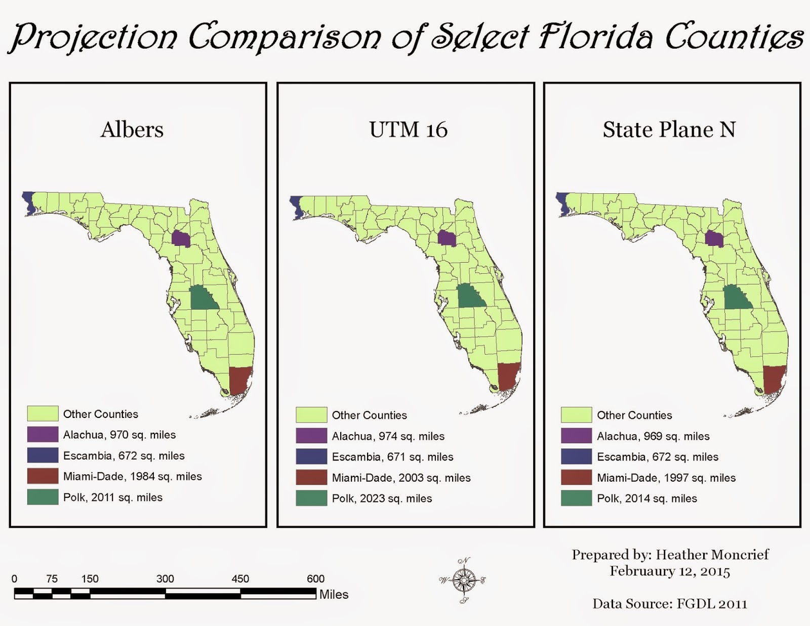
Comparison of three projected coordinate systems, Albers, UTM 16, and State Plane N projected onto the state of Florida. Alachua, Escambia, Miami-Dade and Polk Counties are highlighted as examples. Source: FGDL 2011
This week we learned about projections and how they affect the map-making process. I enjoyed making these maps, especially seeing the difference in the projected coordinate systems. This is honestly something I had never considered before. I think it is definitely beneficial that we set up the maps this way, with three on one image, it allows you to be able to see the slight differences in the shape of the state. Showing the area of the counties across all of the maps is very helpful as well, since it shows the slight differences in size among the projections.

I set my maps up very similar to the example provided, because I thought it was set up well and wanted to see if I could teach myself a couple of things while doing the lab. This did add a little bit of time to my lab time since every time you make major changes to your legend, you have to reset the color ramp. I think I set those colors 4 times!

Tuesday, February 3, 2015

Week 4 - IntroGIS - ArcGIS Online and Map Packages

Information for map package uploaded onto ArcGIS Online for "Use and modify map and tile packages" exercise.
This week's lab exercise was different, because we did not create a map like we have been doing. We also were following instructions straight from ESRI using their Virtual Campus. It was nice that their instructions were easy to follow, similar to our UWF course. The images included in this post show what the packages look like, including the description, properties and access and use constraints. You can edit this information if needed. I really like the fact that sharing the map package is so easy to do, and that you can select who to share it with, which is great for collaborating on projects. It is also nice that you can open up the package directly from the site into ArcGIS for Desktop. 


Information for map package uploaded onto ArcGIS Online for "Optimize a map package" exercise

Friday, January 30, 2015

Week 3 - IntroGIS - Cartography

Topography map of Mexico. Green depicts lower elevations, whereas brown indicated higher elevations. Data Source: UWF, ESRI (2007)
I really enjoyed working on this lab. We made three separate maps: one for the states of Mexico, with a color ramp depicting population sizes; one for showing the major highways, railroads along with primary and major rivers of Central Mexico; and the above topography map. I liked the fact that although we worked with totally different data sets, we mapped relatively the same area. This shows a small sample of the different kinds of information that can be utilized when using a GIS. We used raster data for the first time in order to make the topography map, which was quite interesting to work with. I did realize that I am slightly OCD in the fact that it bothered me greatly that there was no "texture" to the surrounding countries.


Thursday, January 22, 2015

Week 2 - IntroGIS - Own Your Map

Map showing the location of the UWF campus within Escambia County, Florida. Source: FGDL2008
I had a lot of fun creating this map. I really like the fact that our instructions allow us to add our own personal touches to the maps that we create. I did have one little time-consuming issue in the beginning with the Overview: Escambia County data frame (inset). I misunderstood the directions and struggled to keep the image within the frame ( I was re-sizing and panning repeatedly). I did finally realize that all I had to do was "Zoom to Layer". I really like that this week's lab built on last week's, reinforcing what we have learned so far. I look forward to improving my skills through the upcoming weeks.

Wednesday, January 14, 2015

Week 1 - IntroGIS - ArcGIS Overview Lab


Map 1. Population of countries across the globe. Colors coordinate to population size, with teal being least populated and white being most populated. Black squares indicate major cities. Data Source: USGS 2008.

This was my first time working with ArcGIS, and I found it fairly user friendly when following the instructions given. The biggest struggle that I had was with learning how to save the file correctly for later use. I learned the hard way that you cannot rearrange your files after saving and expect for your map to come back up, that you must save again in the new file structure. 

At first I was not happy with the size of the legend for this map, I wanted it larger for better reading, but was not sure how to do so. Luckily, someone posted in our discussion forum how to do so (using the Pan Tool). I also do not like that the first value for the lowest populated countries is -99,999 instead of 0. However, for my first map, I am happy with it overall.