Thursday, February 19, 2015

Week 6 - IntroGIS - Projections Part II

Storage tank contamination in portion of Escambia County, FL. Couldn't get the sites to show up on my map to save my life. Will continue to work on it over the weekend, and will hopefully be able to fix it.
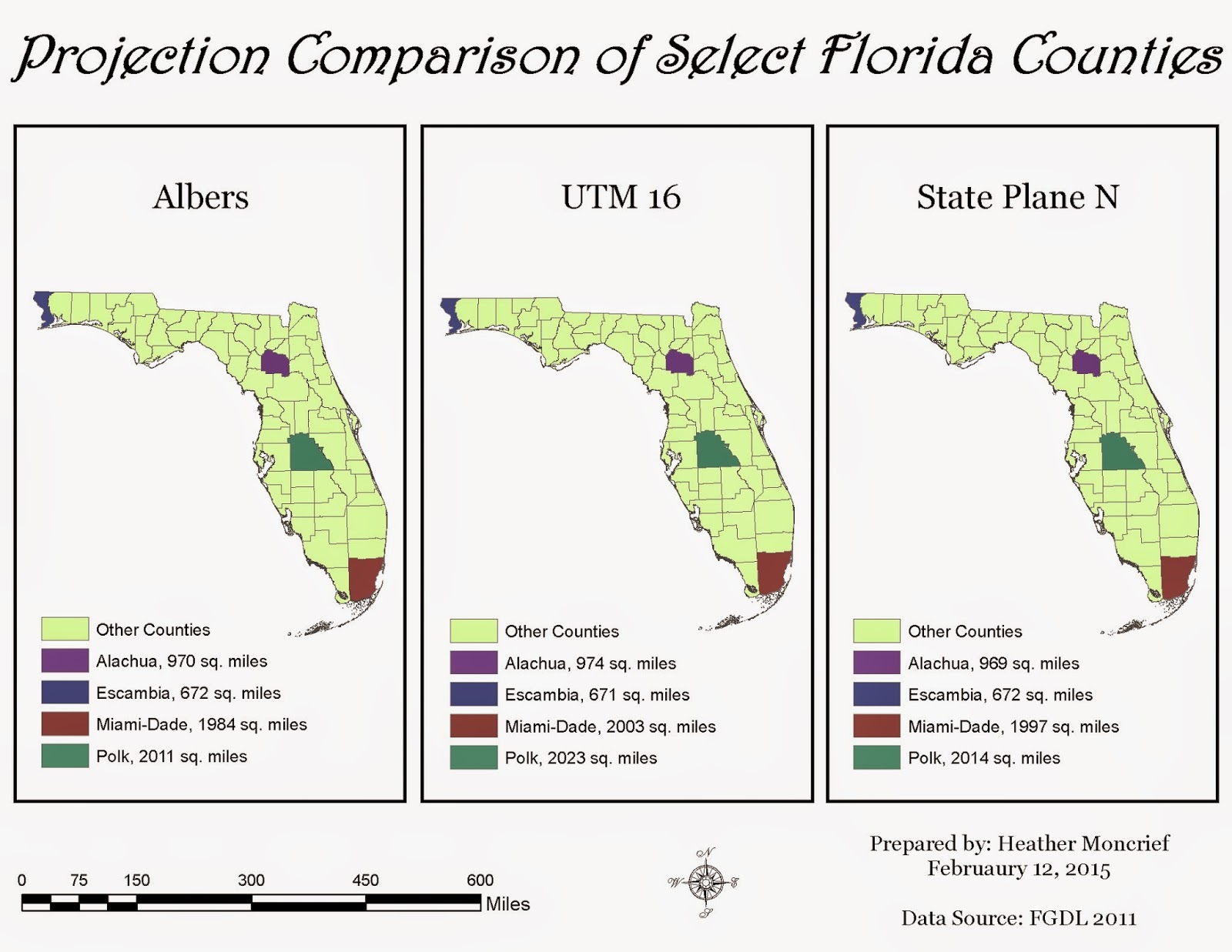
This week we continued working on projections, a very complex subject. I am not happy with my map, I really struggled with this one and ended up running out of time. I still like the whole concept of projections, but still have much to learn. I intend to spend the weekend going over the material and fixing the errors that I have (such as missing data).

------

Storage tank contamination in portion of Escambia County, FL. Source: FL DEP. 
I am much happier with how this map turned out, now that I was able to spend more time on it. I realized that I was in the wrong projection (feet), so that was why I could not get my sites to show up. Makes sense, seeing as we are working on projections. I am much more confident in the concept of projections, and hopefully can expand on them further with the upcoming mid-term.

Thursday, February 12, 2015

Week 5 - IntroGIS - Projections Part I

Comparison of three projected coordinate systems, Albers, UTM 16, and State Plane N projected onto the state of Florida. Alachua, Escambia, Miami-Dade and Polk Counties are highlighted as examples. Source: FGDL 2011
This week we learned about projections and how they affect the map-making process. I enjoyed making these maps, especially seeing the difference in the projected coordinate systems. This is honestly something I had never considered before. I think it is definitely beneficial that we set up the maps this way, with three on one image, it allows you to be able to see the slight differences in the shape of the state. Showing the area of the counties across all of the maps is very helpful as well, since it shows the slight differences in size among the projections.

I set my maps up very similar to the example provided, because I thought it was set up well and wanted to see if I could teach myself a couple of things while doing the lab. This did add a little bit of time to my lab time since every time you make major changes to your legend, you have to reset the color ramp. I think I set those colors 4 times!

Tuesday, February 3, 2015

Week 4 - IntroGIS - ArcGIS Online and Map Packages

Information for map package uploaded onto ArcGIS Online for "Use and modify map and tile packages" exercise.
This week's lab exercise was different, because we did not create a map like we have been doing. We also were following instructions straight from ESRI using their Virtual Campus. It was nice that their instructions were easy to follow, similar to our UWF course. The images included in this post show what the packages look like, including the description, properties and access and use constraints. You can edit this information if needed. I really like the fact that sharing the map package is so easy to do, and that you can select who to share it with, which is great for collaborating on projects. It is also nice that you can open up the package directly from the site into ArcGIS for Desktop. 


Information for map package uploaded onto ArcGIS Online for "Optimize a map package" exercise

Friday, January 30, 2015

Week 3 - IntroGIS - Cartography

Topography map of Mexico. Green depicts lower elevations, whereas brown indicated higher elevations. Data Source: UWF, ESRI (2007)
I really enjoyed working on this lab. We made three separate maps: one for the states of Mexico, with a color ramp depicting population sizes; one for showing the major highways, railroads along with primary and major rivers of Central Mexico; and the above topography map. I liked the fact that although we worked with totally different data sets, we mapped relatively the same area. This shows a small sample of the different kinds of information that can be utilized when using a GIS. We used raster data for the first time in order to make the topography map, which was quite interesting to work with. I did realize that I am slightly OCD in the fact that it bothered me greatly that there was no "texture" to the surrounding countries.


Thursday, January 22, 2015

Week 2 - IntroGIS - Own Your Map

Map showing the location of the UWF campus within Escambia County, Florida. Source: FGDL2008
I had a lot of fun creating this map. I really like the fact that our instructions allow us to add our own personal touches to the maps that we create. I did have one little time-consuming issue in the beginning with the Overview: Escambia County data frame (inset). I misunderstood the directions and struggled to keep the image within the frame ( I was re-sizing and panning repeatedly). I did finally realize that all I had to do was "Zoom to Layer". I really like that this week's lab built on last week's, reinforcing what we have learned so far. I look forward to improving my skills through the upcoming weeks.

Wednesday, January 14, 2015

Week 1 - IntroGIS - ArcGIS Overview Lab


Map 1. Population of countries across the globe. Colors coordinate to population size, with teal being least populated and white being most populated. Black squares indicate major cities. Data Source: USGS 2008.

This was my first time working with ArcGIS, and I found it fairly user friendly when following the instructions given. The biggest struggle that I had was with learning how to save the file correctly for later use. I learned the hard way that you cannot rearrange your files after saving and expect for your map to come back up, that you must save again in the new file structure. 

At first I was not happy with the size of the legend for this map, I wanted it larger for better reading, but was not sure how to do so. Luckily, someone posted in our discussion forum how to do so (using the Pan Tool). I also do not like that the first value for the lowest populated countries is -99,999 instead of 0. However, for my first map, I am happy with it overall.